Seeing the Wave Differently: How Photo Editing Tools Are Finally Getting Serious About Color Accessibility
For most people, dragging a wave filter across a photo and watching the colors shift and ripple feels like pure creative joy. But for the estimated 13 million Americans who have some form of color vision deficiency (CVD), that same experience can feel like trying to read a menu in the dark. Reds bleed into greens. Blues and purples become indistinguishable. What looks like a bold, expressive edit on one screen can appear flat, muddy, or even unrecognizable on another — specifically, the one in your own eyes.
The photo editing world has been slow to reckon with this. But that's starting to change, and wave-based editing tools are sitting right at the center of a genuinely interesting accessibility conversation.
The Invisible Barrier in Creative Tools
Color vision deficiency isn't a single condition. Deuteranopia, protanopia, tritanopia — each affects how a person perceives specific wavelengths of light. The most common forms, deuteranopia and protanomaly, affect the red-green spectrum and show up disproportionately in men (around 8% of men in the US have some form of CVD, compared to about 0.5% of women).
For photo editors, this creates a practical problem that goes beyond aesthetics. When you can't reliably distinguish between two similar hues, applying a wave filter that subtly shifts those hues becomes a guessing game. You might love the way an edit feels to apply — the motion, the texture, the contrast — but have no way of knowing whether the final result actually looks the way you intended to the majority of your audience.
"I've been editing photos for years, and I still can't tell if my warm-toned wave edits are reading as golden hour or just... orange soup," says Marcus T., a hobbyist photographer from Austin who has deuteranomaly. "It's not that I can't edit. It's that I'm always guessing."
That guessing game is what accessibility advocates want to eliminate.
What Actually Works for Colorblind Users
Here's the good news: not all wave effects are created equal when it comes to accessibility, and some genuinely work better for users with CVD.
Contrast-based wave effects — filters that emphasize light and shadow rather than hue shifts — tend to be far more useful for colorblind editors. When a wave filter operates primarily in the luminance channel (affecting brightness and texture rather than color), it produces results that are readable and expressive regardless of how the user perceives color.
Similarly, wave effects that lean into desaturation or work within high-contrast color pairings (think deep navy against bright white, or black-and-white with a single accent tone) give colorblind users more predictable, controllable results. The visual "wave" becomes about movement and form rather than chromatic shimmer — and honestly, some of the most striking edits on any platform right now are using exactly this approach.
Accessibility consultant and UX designer Priya Nair, who has worked with several creative app developers on inclusive design, puts it plainly: "The filters that perform best for colorblind users are often the ones that perform best for everyone in low-light or small-screen contexts. Accessibility isn't a niche concern — it's just good design."
The Platform Question: Is Inclusive Design a Priority?
The harder question is whether photo editing platforms are actually building accessibility into their filter development pipelines — or just bolting it on as an afterthought.
Some competitors have introduced colorblind simulation modes, which let designers preview how their filters will appear to users with different types of CVD. It's a smart move, though critics point out that a simulation mode for designers doesn't necessarily help the colorblind user who's actually trying to edit their own photos.
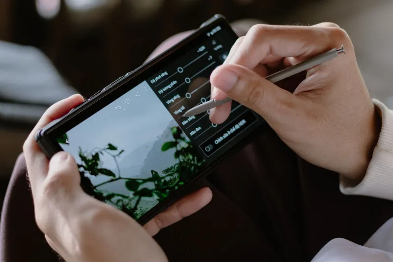
What would genuinely help? A few things stand out. First, labeling filters by their primary effect type — contrast, texture, hue shift, saturation boost — so users can make informed choices without needing to preview everything. Second, offering wave filter variants specifically optimized for high-contrast or luminance-based editing. Third, integrating real-time accessibility overlays directly into the editing interface, so users can toggle a CVD-simulation view of their own work-in-progress.
WaveMyPic's own interface has made strides in contrast and texture-forward filter categories, which inadvertently serve colorblind users well — but the conversation about intentional, documented accessibility features in wave editing is still in early stages across the industry.
"The tools exist," says Nair. "What's missing is the institutional commitment to center accessibility in the design process from day one, not as a patch after launch."
Beyond Color: Other Visual Processing Differences
Color vision deficiency is the most discussed accessibility gap in photo editing, but it's not the only one. Users with low vision, light sensitivity (photophobia), or certain forms of visual processing disorders face their own distinct challenges with heavily animated or high-saturation filter interfaces.
Wave effects that include motion previews or flickering transitions can be genuinely uncomfortable — or even triggering — for users with photosensitivity. This is an area where the entire category of "dynamic" photo filters needs more careful thought. Static preview modes, reduced-motion settings, and adjustable animation speeds are all low-lift solutions that can make a meaningful difference.
The broader point is that accessibility in creative tools isn't just about whether someone can use the app. It's about whether they can use it with the same degree of creative control and expressive freedom as everyone else. Right now, that gap is real.
The Creative Case for Accessible Design
There's a business argument here too, and it's not a small one. Thirteen million Americans with CVD represent a significant user base. Add in people with low vision, photosensitivity, and other visual differences, and you're talking about a substantial chunk of any photo platform's potential audience.
But beyond the numbers, there's something worth saying about what accessible wave editing actually produces aesthetically. The constraints that make a filter work for a colorblind user — strong contrast, textural depth, luminance-first thinking — are often the same constraints that make an image pop on a phone screen at 7 AM, or hold up when printed small, or read clearly in a thumbnail.
Designing for the edges doesn't water down the creative experience. It sharpens it.
For platforms riding the wave of photo editing culture, the opportunity to lead on accessibility isn't just the right thing to do. It's a genuinely smart creative and strategic move — one that could define which platforms feel truly inclusive, and which ones quietly leave a big part of their audience behind.